Branding Work
Scroll down to see the work
JDO GLOBAL | June Fresh Soy Sauce
JDO Global commissioned me to create a series of illustrations in an engraving/woodcut style for the premium soy sauce brand, June Fresh.
There were a variety of flavours, including - Button Mushroom, Matsutake Mushroom, Soya Bean, Honey, Lemon & Tangerine, Scallop & Kelp and Yellow Ice Sugar - the order corresponds to the layout of the illustrations below.
I was intially briefed to create the designs for three of their ranges, but that eventually evolved to seven after the client was very pleased with the work. Visit the website here to see the work on pack.

Tangerine & Lemon

Honey

Button Mushroom

Matsutake Mushroom

Soya Bean

Scallop & Kelp

Yellow Ice Sugar

BULLETPROOF | Cruzcampo
I was commissioned by Bulletproof Creative Agency to update the Gambrinus cameo for Cruzcampo’s Lemon Radler as well as to illustrate the lemons.
The cameo needed to be simplified for better legibility as well as for the forms to read better and have more dimensionality. The end result was a combination of my version with some further simplification applied later by the designers.
My re-draw continues to be the design used on the updated Cruzcampo bar fonts.


ELMWOOD | Strongbow
Elmwood Singapore asked me to create a series of illustrations for a new Strongbow sparkling cider, to be released in Vietnam.
There were particular design rules that needed to be adhered too - the line-weight needed to be consistent throughout the range as the designs were going to be printed on cans.


SILAS AMOS | Schmidts Deodorant
I was commissioned by Silas Amos to design some botanical illustrations in a lino/woodcut style.
The designs each had their own individual colour scheme across the range, and it was my job to create compositions that showed off the ingredients, whilst adhering to the cutter guide.

BROOKFIELD DRINKS | Kestrel Beer
Kestrel beer is an independent brewers based in Scotland.
I was commissioned by a designer to create a poster/t-shirt design for an event themed around the refurbishment of an old Riley Kestrel motor-car - nicknamed the Flying Kestrel. The design needed to be somewhat photo-real, with wings attached to the side of the car.
Additionally, I was employed again at a later date to update the logotype for their premium lager range. I provided a number of options, using various wing motifs to create a visually engaging and creative logotype.

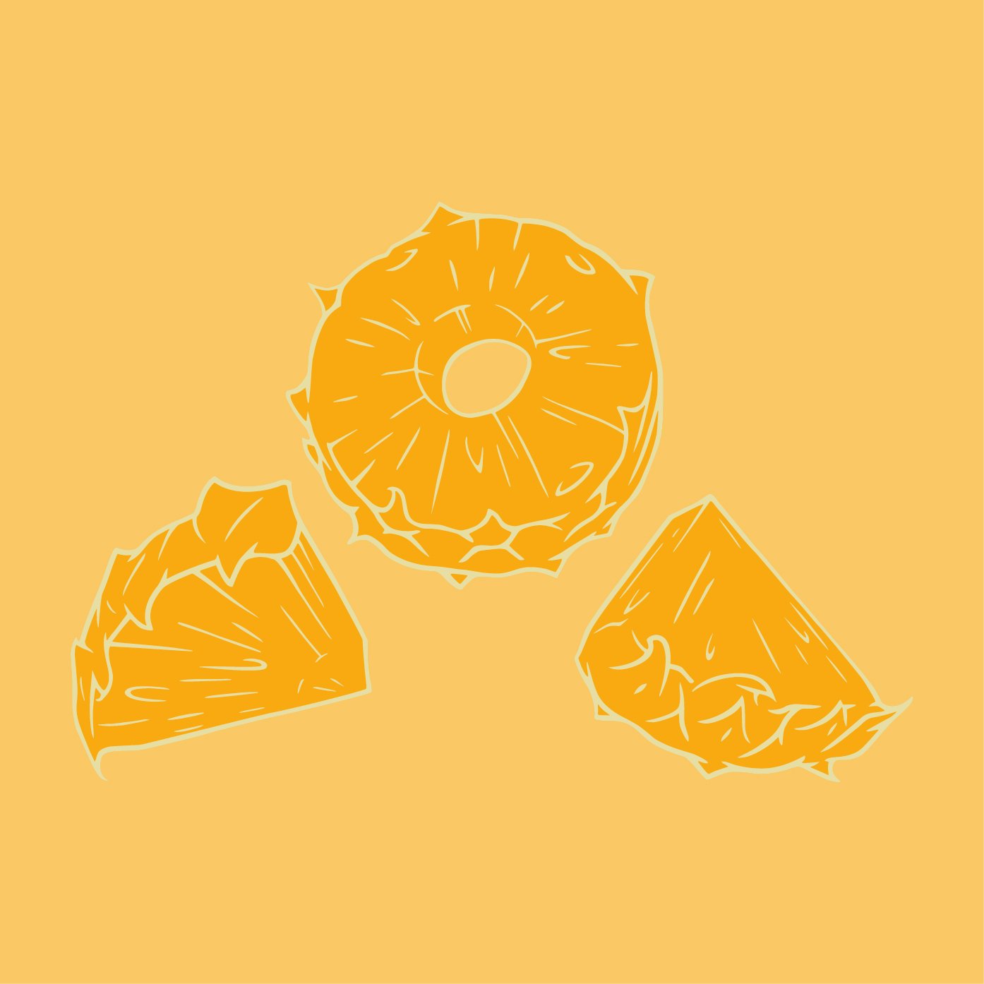
Fruit Illustrations | Watermarks | Logos | Symbols
A range of illustrations created during my time working as an in-house illustrator for the London design agency, Claessens International.
Copyright, and all Rights Reserved by Claessens International.

Ketel One Oranges

Ketel One Lemons

Futyulos Raspberries Illustration

Futyulos Plum Illustration

Futyulos Almond Illustration

Futyulos Blueberries Illustration

Futyulos Apple Illustration

Limes Style Illustration

Grapes Watercolour Illustration

Grapefruit Watercolour Illustration

Lemons Photo-real Illustration

Cinnamon Woodcut Illustration

Hops Woodcut Illustration

Woodcut Illustration

Cardamom Woodcut Illustration

Nicholosons Gin

Whistlepig Whiskey

Whistlepig Whiskey
House Illustration

Bayou Rum

Old Kenigsberg

Illustration
Whistlepig Whiskey Symbol

Fritz Kola Option

Fritz Kola Option

Sobieski Cameo

Seven Yards Whiskey

The Write Trail Logo
Cameo
Sobieski Logo
Logo

Nicholson Gin Cameo
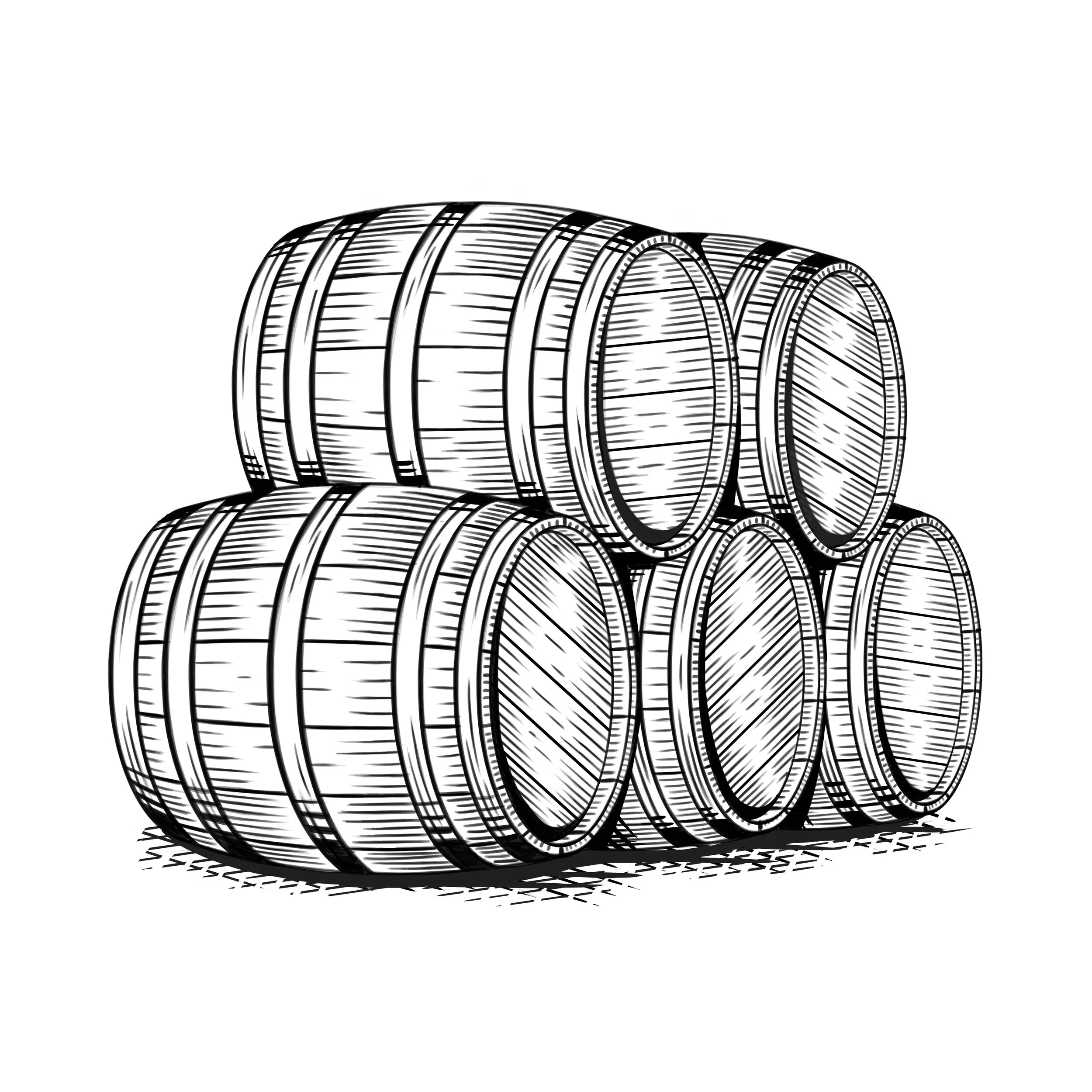
Barrels Spot Illustration

Barrels Spot Illustration

Spot Illustration

Crown Symbol

Bayou Rum Symbol

Bayou Rum Symbol

Symbol

Chubby Water Illustration

Chubby Water Illustration

Chubby Water Illustration


